Post-production
post-production
Editing

Credits rolling in...
1. A film by....
2. All actors/actresses
3. Directed by.....
4. Produced by.....
5. Screenplay/written by.....
6. Director of cinematography....
7. Camera director...
8. Lighting operator...
9. Filming locations
10. Editors...
11. Supervisors
12. Special thanks to...

So far, I've started adding titles to where I will put credits in, and the screenshot above shows me adding titles to my film, however I need to cut down majority of my clips, as they're very long and some I need to still adjust.

The screenshot above displays a credit title, in which, "screenplay by", is displayed. I have experimented with various different types of credits and adjusted the titles as per their colour, 2D styles, etc. I've also decided on which colour would be the primary colour in my film and be seen with most credits, but some colours may not be entirely visible with the background colour. An example of this was the scene above, as I changed the purple colour tone quite a lot, in order to find which exact colour would ideally fit in with the background of a light-wood tone.
FontS
In terms of font types, I've found various types of fonts, which would suit credits. All of the fonts below, are ones I would like to possibly include in the credits, as it subtly stands out, and does not interfere with the background action. I also want fonts that aren't particularly large or disrupts the scenes.
Experimentation:

1. Contemplate font


For flashbacks, I added focus blur on the outside sides of the scenes, in order to connote the idea of a vision playing back. The amount of blur took a bit of time to understand, and to perfectly get in sync with the scenes without disrupting the onscreen action. In order to do this, I had to make sure the blur wasn't excessive or heavy. Once I knew I had a decent enough blur, I created it as a preset.


This font was very prestigious and very traditional.
2. Synchro Lift
Font type:
- engravers gothic regularColour correction
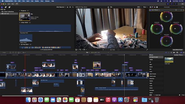
For CC, I decided to make my tailor shop scenes a bit more yellow, but not too much as the shop was already dimly lit with yellow lighting. I wanted to symbolise the idea of obsession and frustration, which reflects the state of my killer. With the colour curves, I experimented with the different tones of shading and with the colour wheels, experimenting with the highlights and midtones.
This is another example of my experimentation with CC, in which I moved the red colour curve to its furthest point, in order to see how dark the red light could go. When I did this, the whole background of my scene became pitch black, with the only bright lights becoming red. This proved effective, and it furthers reiterates the idea of death, violence and anger. However, it didn't really fit in well with all the other colour components, therefore I removed it.
Flashbacks
Sound effects and copyright free soundtracks:
Sound effects downloaded:
- Wet Meat Twist and Rip
Tracks downloaded:
- Black Mass — Brian Bolger
- Nocturne — Asher Fulero
- Interloper — Kevin Macleod
- Chomatic3Fantasia, Classical Rousing — Kevin Macleod (require license)
- Allemande — Wahneta Meixsell (require license)
- Toccata in D minor (by Bach) - copyright free
Soundtrack links: https://www.soundtrackmania.net/category/thriller-movie-soundtracks/
/////////
Showing credits:
In terms of showing credits, I decided to use after effects in order to display the credits against hand movements and body movements, which will then reveal credits. As I hadn’t used after effects in a while, I decided to watch a YouTube movie on the rotobrush tool, so that I can remind myself of how to use it properly. This took some time, as I had to propagate each of the rotobrush parts.
Rendering the clip also took quite some time (about more than half an hour).
Actual video:
YouTube video used to aid:
Sound

In terms of sound, I decided to firstly experiment with the different sounds on the YouTube audio library, and try to find one which would fit for my narrative. I found a copyright free version of Toccata in D minor by Bach, and found lullaby music which was calming and ultimately fitted in with the whole creepiness of the narrative. However, the music seemed to overpower the film, and therefore, I will need to lower the decibels, in order for the small parts of dialogue to be heard.
Colour correcting new clips

Colour correcting the mannequin to fit in with the sequence.

Using rotobrush to slowly reveal credits. The frames are being propagated, which took some time. After freezing the frames, it took quite some time for the frames to properly work.

This is a cc preset for my film, when testing it, the colour correction came out well and really exemplified the colours and made the whole film look more 'thriller-like'.
Adding credits…

Adding credits with the designated font choice took some time, as I had to review the many font types, and really had to find which ones would suit my film best.
Using 3D tracking on after effects:
.png)
.png)


Comments
Post a Comment